There are a variety of reports inside your Customer Thermometer account.
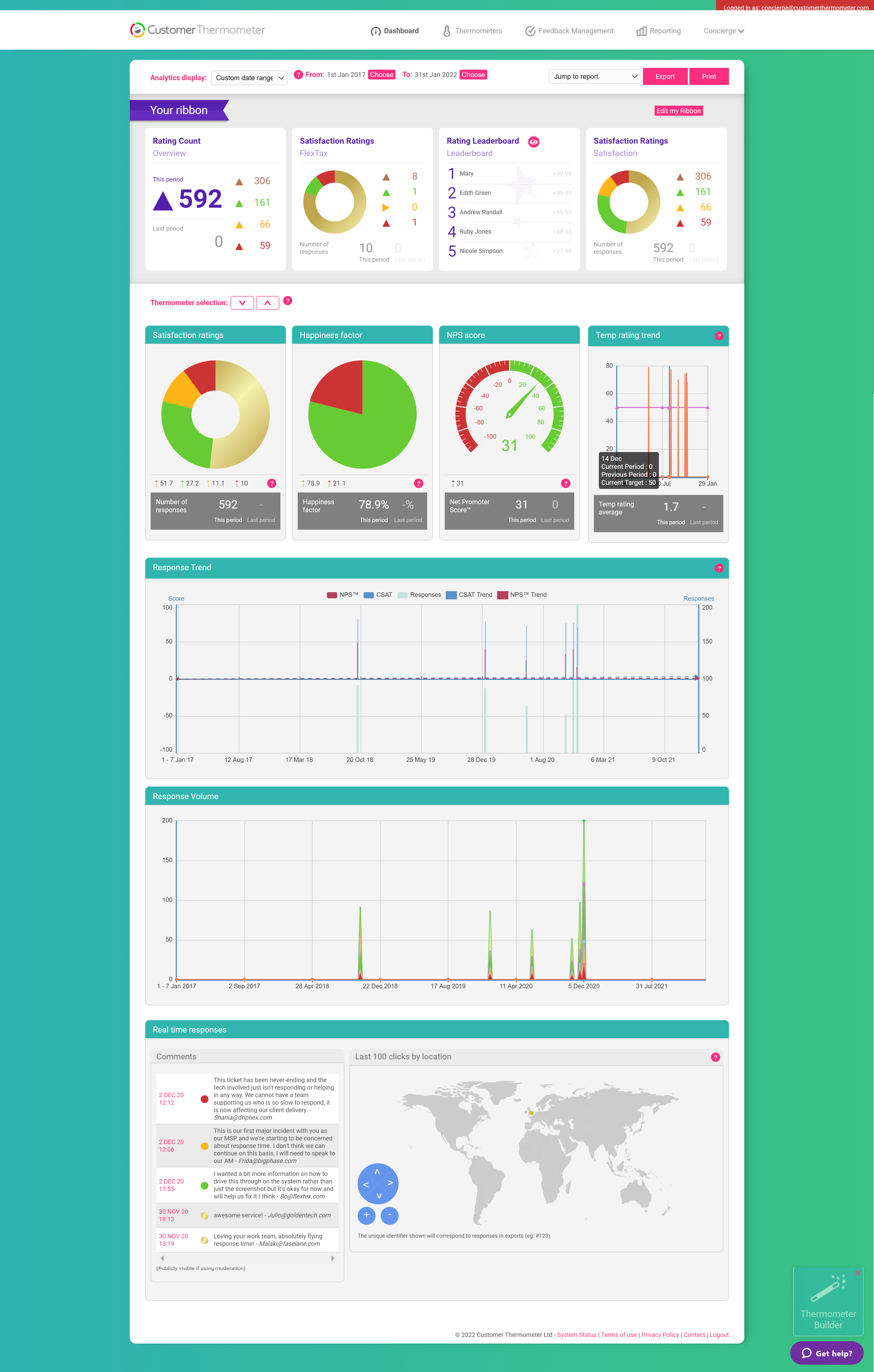
Your 'Mission Control' dashboard is the first screen you see when you log in to your account, it produces an overview of all accumulated results, based on the last 24 hours, last week, last month, or any other date range across all Thermometers.
For more granular and detailed reports, head over to your Reporting area for a deep dive.
Mission Control dashboard example:
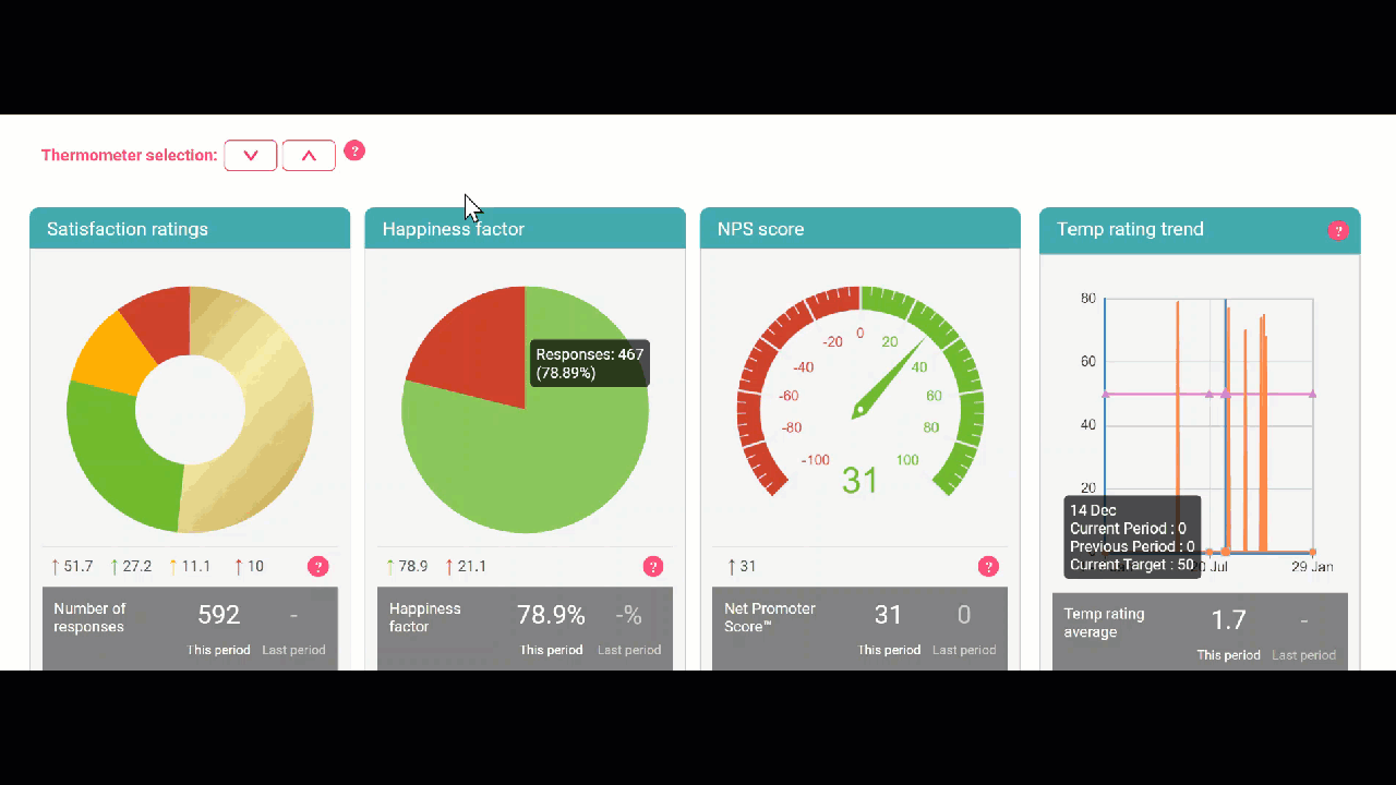
If you would prefer only specific Thermometer data to show on the main Dashboard, you can use the arrows as shown below to add or remove specific Thermometers from the view:
If you are on a plan higher than the Runner you will also have access to the Ribbon on your main Dashboard.
What’s the difference between the different metrics?
Temperature rating provides a single number per Blast to benchmark trends.
The Pink line is your Target
The Orange line is the previous period
The Blue line is the current period.
Happiness factor is the %age happy vs %age disappointed responses - this is your CSAT score.
NPS score, when enabled, provides your Net Promoter Scores.
This Period is showing you the data point for the date range selected from the date range drop down.
Last Period is the the previous number of same days before what has been selected from the date range drop down.
For example, if your custom date range was set to 1st January 2023 to 19th July 2023, this is 200 days.
Last Period would show you the data point for 200 days before the 1st of January 2023 which would be the data point for 15th June 2022 to 1st Jan 2023. This is the range the Last Period is looking at in this example.