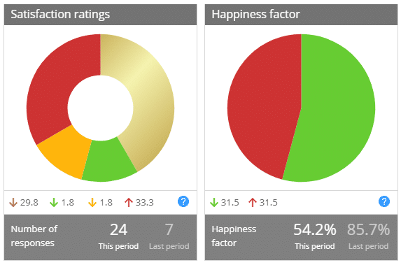
Dashboard variances
Find out whether you’re improving over time
Customer Thermometer calculates (and updates in real time) your Satisfaction ratings and Happiness factor on your live dashboard.
The variances shown will be able to show you whether you’re improving performance (or not) at a glance, however, it’s important you understand what is actually being shown and measured.
The variances shown under each dial display the change in percentage points (note this is NOT a percentage change) between the previous and current periods.
An example

Look at the Satisfaction rating dial.
The previous period’s gold percentage split was 71.4% (seen by rolling over the elements). This period is 41.7%.
The variance is showing as a 29.8 decrease.
The previous period’s red percentage split was 0%. This period is 33%.
The variance is therefore showing as a 33.3 increase.
Providing there was data registered in the previous period, the variances will add up to zero. If there is no data in the previous period, all variances will of course show an increase.
Happiness factor variance works in exactly the same way.
Why are we showing variances in this way?
It would be simple to show the percentage increase in golds / reds etc per period, however, if you received half the number of responses in any given period, it would appear your performance was worse, despite the fact your %age split of golds may have improved.
Providing variance on the %age split gives you an immediate feeling about how you’re doing.